UI Design
User Research
Double Diamond Process
Context
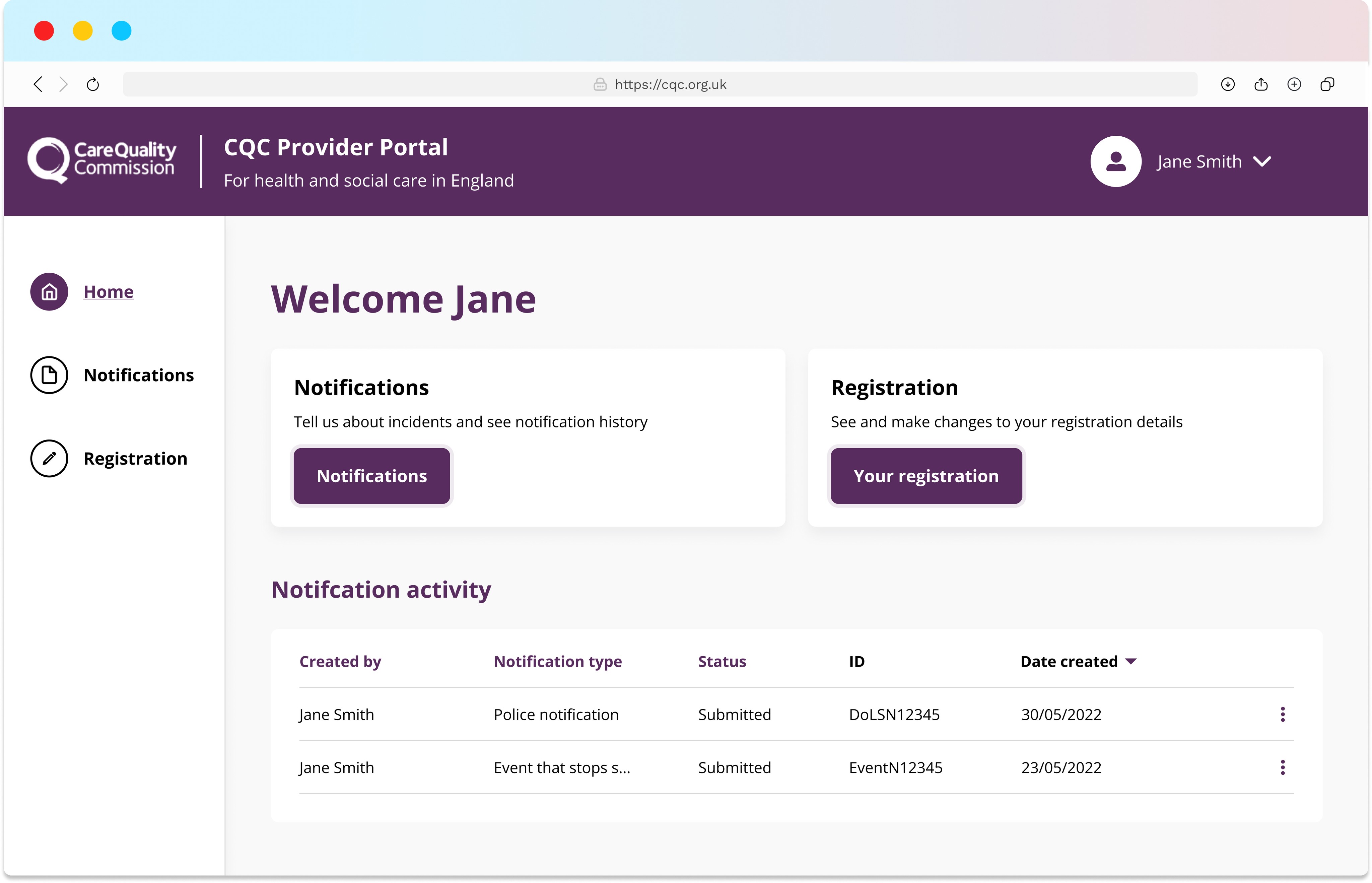
The Care Quality Commission is a regulatory body operating in the UK to assess care standards across varying types of providers. This project as a whole was the creation of an online portal where care providers can store and submit reports to the CQC.
I was in charge of the stream of work known as notifications. Specifically, I was involved with the design of the police, abuse and absent registered provider notifications.
I worked on both the creation of these notification forms as well as managing the provider portal and CQC staff design system.
The Project
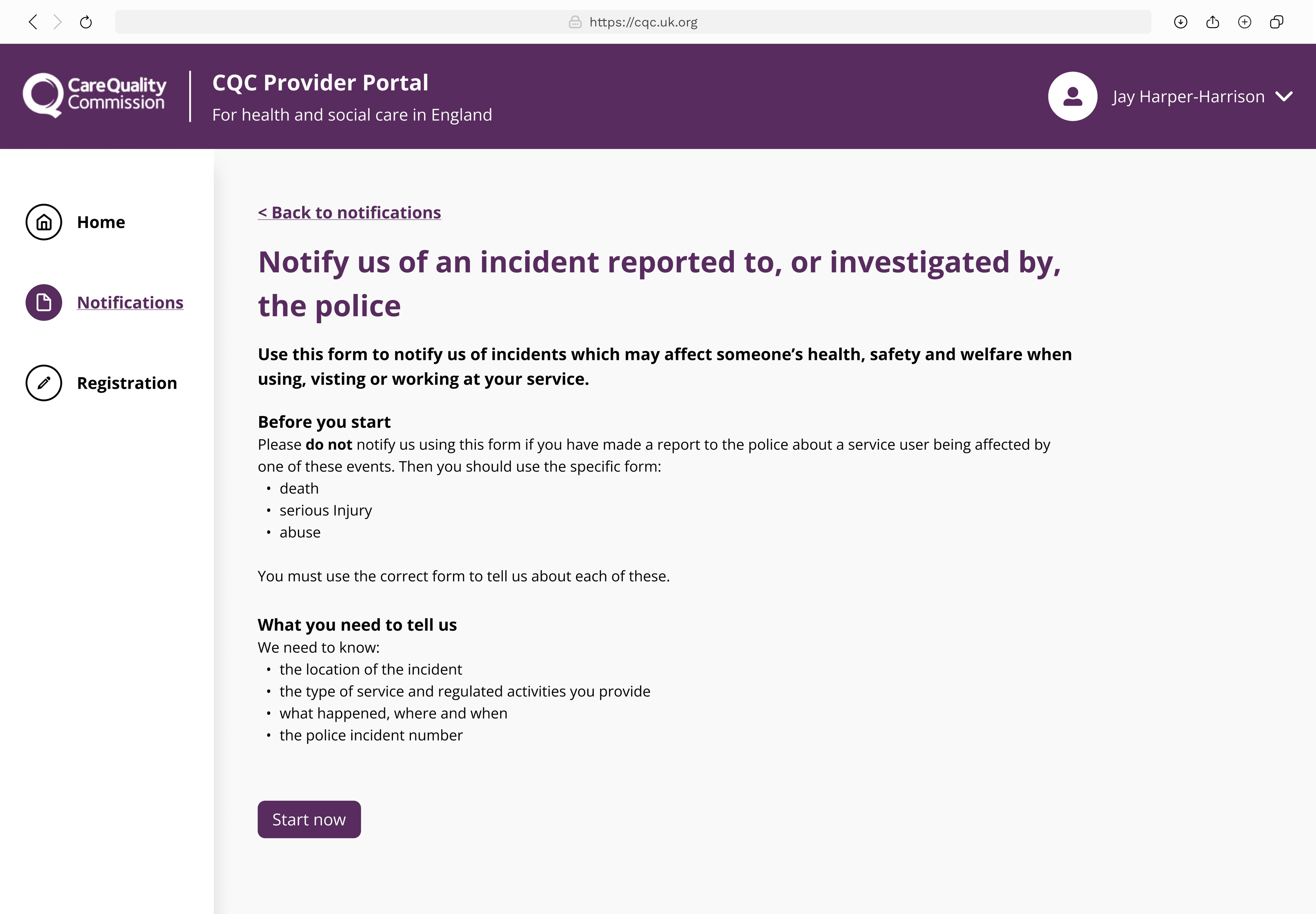
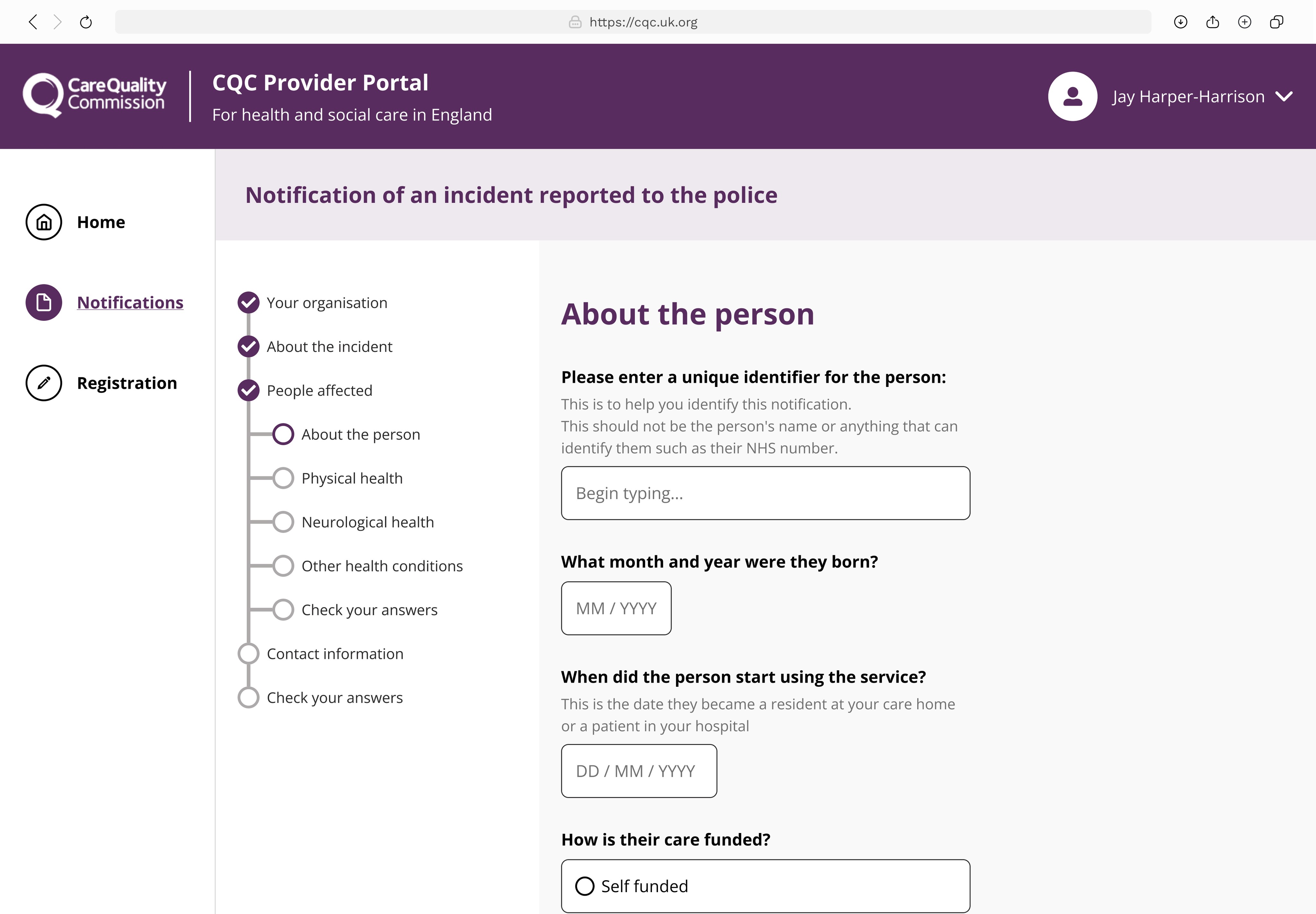
This piece of work concerned the design of a police notification (report) for the new provider portal, detailing the process and steps involved to move into private beta release.
There also was an opportunity to test and refine the existing email form for police reports, to understand provider's experience with it and ultimately make improvements.
The Team
The notifications team consisted of:
Project manager
Business analyst
User researcher
UX designer
Content designer
Accessibility specialist
Development team
QA team
Users
Care provider staff:
People who worked in care facilities need to report incidents to the CQC, and can do so using the provider portal.
There were different permissions within the portal per user such as the access to view a notification, edit a notification, change the account password and add other users.
Double Diamond Process
Discover
Research
Conducted initial research with a group of care providers and CQC agents to understand the requirements for the police notification.
Key Findings from Care Staff
They did not always have the information about the care users that were asked in the police notification forms.
Questions around religion or sexuality were sometimes not possible to answer as the person the notification was about either could not, or did not want to answer.
Define
Analysis
We as a team mapped out user requirements and key considerations using an affinity diagram. A dot vote took place to assess key findings and priorities for the upcoming design phase.
Goals for design phase:
Ensure to state that questions around sexuality, gender and religion are clearly labelled as optional.
Revise UI of staff system to be more accessible and consistent with provider notification.
We then shared our findings with the client before moving onto the develop stage.
Develop
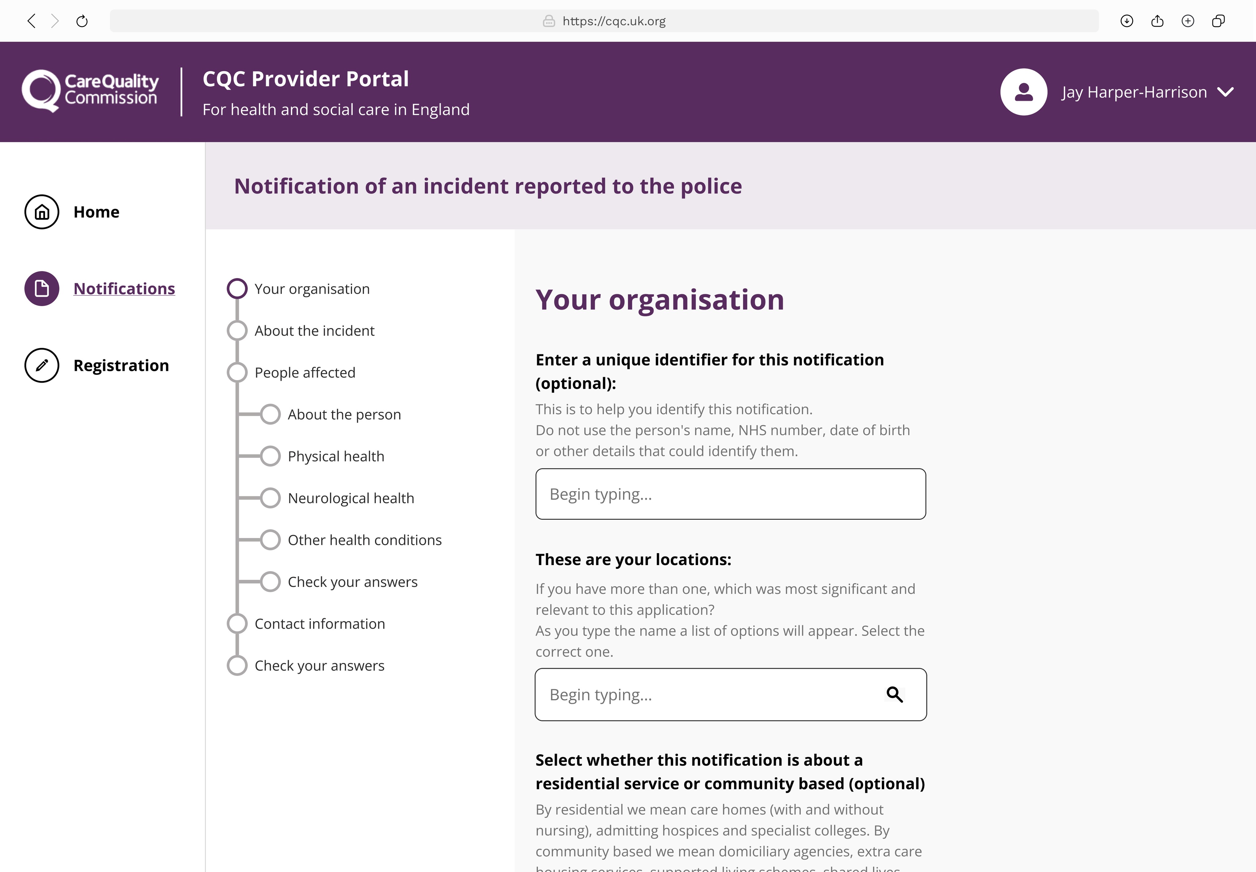
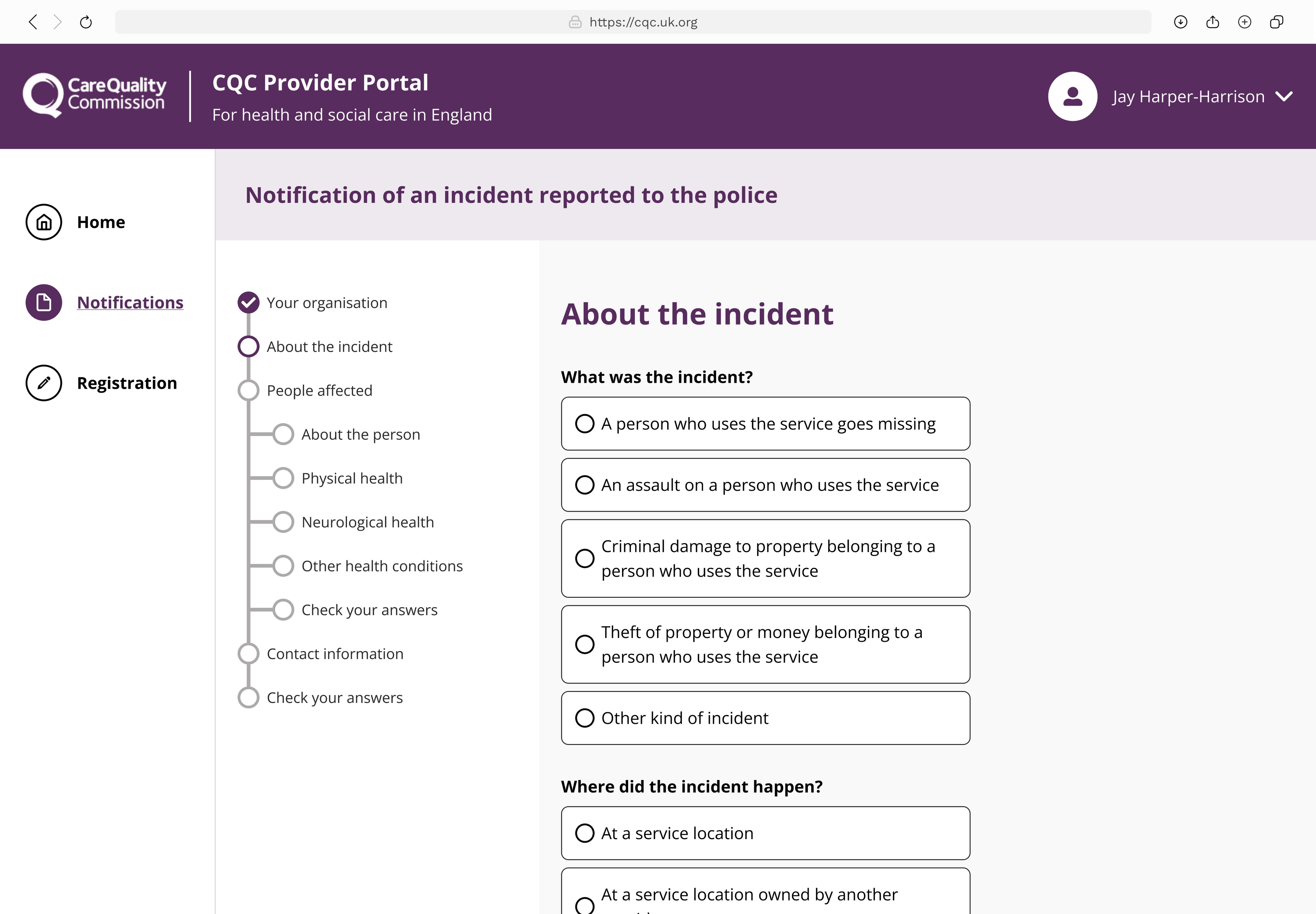
With the analysis in place and signed off by stakeholders, design for the police notification began.
1. Content Design
A question protocol was created with the BAs and content designers to map out the questions, while I noted down the design components that would accompany each question.
Figma Prototype
The police notification was then designed in Figma using the question protocol as a guide.Usability Testing
Invited participants from initial research sessions
Consisted of a usability testing session where the user completes a police notification while explaining why they took certain actions.
Accessibility testing took place during this sprint to ensure that the portals are adhering to government standards.
Test Findings
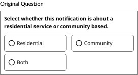
Content was not clear in some sections, particularly the difference between community based care service.
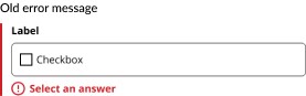
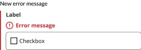
Serious accessibility concerns were flagged by our specialist: - The error messages did not make sense via a screenreader - Focus states did not pass accessibility testing, nor did they align with government standards.
Deliver
Accessibility Adjustments
New and improved error messaging states were now in alignment with GDS.
The old message contained the errors below the form field, a screen reader requires such messages to be nested within the field instead. This way it is clear where the message belongs.
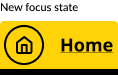
Focus States
Focus states were updated across all components in the design system to adhere to GDS and match the consistency of the CQC website.
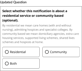
Content Adjustments
Additional text was added to this question to explain clearly what is meant by residential or community based services.
Handover
Once the feedback from testing was addressed in the design, handover took place between design and development.
Designs were added to user stories in Azure, where they are reviewed by the PM and sent into development.
Impact
The portal was now ready to enter into a phase in UK government known as 'private beta'. From here, a small group of users are invited to use the portal, in which feedback and analytics are monitored.
Accessibility compliance was addressed across the entire provider portal design system as a result of accessibility testing during the develop phase.